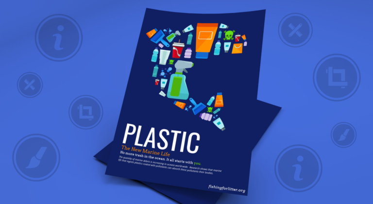
Among all the things, posters are the oldest and tried marketing strategies of all time. These can be really effective in bringing the attention of your customers to your sales, events and etc. and if you are having difficulty in designing the posters, there are some best practices on the poster design that you should follow. So here is the guide for you with the most amazing designs you might need. However, if you are a beginner and want to learn how to design from scratch, you are in the right place. Here all the designing tips will be provided to you but also remember that poster printing needs advanced printers to get the best results.
Designing Tips for an amazing poster
The first step is to recognize the goal
You need to identify, what you want to inform people through your poster. Do you want to tell people about your new product? Or to tell them about the concert in their range? Or want to tell them about the sale coming up? These things can be achieved by designing a poster for the purpose. If you already have an idea about what is the purpose of your posters, it will help you to decide about the design for your poster. For instance, if you want to inform people about the conference, you need to design your poster in a simpler way. Because you know in these kinds of designs simplicity always wins.
Think about your intended audience
Your next goal while designing a poster is to recognize who are those people you are trying to reach through your poster. This identification can solve the confusion about the design of your poster. Now imagine, you are designing a poster for a fundraising event. What do you think your poster should look like? It should be professional and most definitely simple. The colors, the layout should portray professionalism. Because your main goal is to attract senior citizens, the more professional audience with your poster. The most important thing in poster designing is that you need to decide who you want to attract through it.
After deciding about the audience you want to share it with, you have to decide about where it will be shared. Are you going to print them or design them to hang your posters on the wall? Or just want to share on social media? It is also important before stepping into a designing process that where you want to share it. Imagine where you want to pin your poster. If you are going to pin it on the wall with other posters then print them in a large size so that they can stand out from others. Or if you are hanging it on a bare wall, the size can be small but pin a bunch of them. The next thing you have to do is to set the bleed marks. Because when your text or the images are lurking out of the bleed area, it could be a problem for your design. And the overall poster printing would be really awful.
Initiate with ready-made poster templates
When you look into the ready-made poster templates while designing. It will give you a basic idea about how to design your own. First, select the templates that are more relatable to your poster. Search for the designs that have the theme you are looking for or have the layout that seems right for your poster. For example, if you are designing a poster for your business, the focal point should be the products, expertise, and your motto. However, if you are advertising for a sale, the most eye-catching part of your poster would be the date and the discount. Select the template that adjusts with your goal and a ton of your time will be saved.
Relevant color scheme
People are attracted to the visual aspects more than the written elements. They are going to notice the color theme first in your poster. You can win customers with the appropriate color scheme. Let’s imagine you need to design a poster for a winter event what kind of colors would be good for that? Warm colors such as green, red or white can invoke feelings of a holiday. However, if you are still confused about the colors, you can learn the emotion behind each color and decide.
Add call to action
Once you have grabbed the attention of your intended audience, the next thing is that you should guide them to the next step in your poster. And this is said to be the call to action. It’s necessary to include CTA because what is the point of a poster if you are not providing information about how to reach you.
Include icons to envision concepts
You can use icons in your poster for representing the concepts in your design. You can also use them to enhance your text or to totally remove it. Consider icons as an important part of your design because they are great at illustrating ideas quickly.
Hopefully, these things will make your poster printing easy and will be useful for designing your posters in a great way.


